If you want to know how to create a business logo without spending 2,000 EUR on a freelance designer or fighting with complex software, this guide is for you. Modern AI logo generators can produce professional, editable logos in minutes based on your business name and description. This tutorial walks through the eight simple steps to design a logo you will actually be proud to put on your website, packaging and business cards.
Table of Contents
Why Your Business Logo Matters
Before we dive into how to create a business logo, it helps to understand what a logo actually does. A logo is not just a decoration. It is the visual shorthand for your entire brand. Customers see your logo hundreds of times before they read a word of your marketing copy, and it shapes their first impression of quality, trust and personality.
A good business logo works at every size. It looks sharp on a business card at 20mm wide and on a billboard at 20 meters wide. It remains recognizable in one color, on a dark background, in an app icon and on a printed t-shirt. A logo that fails any of these tests will slowly erode your brand consistency, forcing you into workarounds and awkward compromises.
The good news: creating a professional business logo used to cost thousands and take weeks. Today, AI logo generators produce output that rivals or beats junior designers, in about ten minutes, for the cost of a coffee.
Step 1: Define Your Brand Personality
Before touching any design tool, spend twenty minutes writing down your brand personality. A logo without a personality behind it is guesswork. Answer these questions:
- What does your business do, in one plain sentence?
- Who is your ideal customer, and what do they care about?
- What three words describe your brand? (Examples: friendly, honest, expert. Or: bold, modern, minimalist.)
- Who are your top three competitors, and how do their logos position them?
- What feeling do you want customers to have when they see your logo?
Write these answers down on paper or in a note. You will use them at every following step. Skip this step and you end up with a technically fine logo that does not actually represent your business.
Step 2: Study Logos You Admire
Great logos come from great references. Spend thirty minutes collecting logos you find effective, especially from businesses in adjacent industries. Look at:
- Direct competitors: See what conventions exist in your industry
- Adjacent industries: If you sell coffee, look at bakeries, wine bars and tea brands
- Global brands you love: What makes the Nike swoosh or the Apple mark work so well?
- Small brands you respect: Local businesses often have surprisingly clever logos
Do not copy any of these. The point is to build your visual vocabulary and understand what makes a logo effective. Save your favorites in a folder or Pinterest board. When you generate logo options later, this collection becomes your quality benchmark.
Pay attention to what these logos have in common: they are simple, they scale well, they use two colors or fewer, and they usually rely on either a strong wordmark or a distinctive symbol, rarely both fighting for attention.
Step 3: Choose a Logo Style
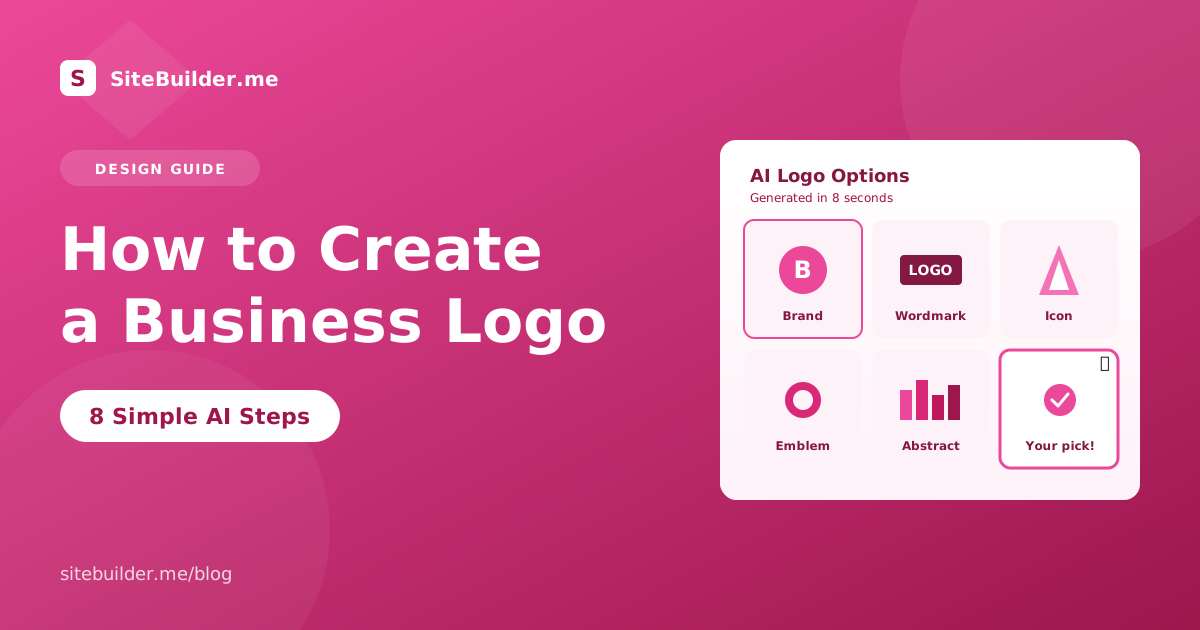
There are five main logo styles for small business. Pick one before you start designing, based on your brand personality:
Wordmark: The business name in a distinctive typeface, no separate symbol. Examples: Google, Coca-Cola, Uber. Works well for names that are short and memorable.
Lettermark: One to three letters, usually the initials of the business. Examples: IBM, HBO, CNN. Works when the full name is long.
Symbol or icon logo: A pictorial mark that stands alone. Examples: Apple, Twitter, Target. Only works if you have significant brand recognition to build, since customers need to learn what the symbol represents.
Combination mark: Wordmark plus a symbol, used together or separately. Examples: Adidas, Burger King, Lacoste. Most flexible for small business because you can use just the symbol on social avatars and the full mark elsewhere.
Emblem: A symbol with text incorporated inside it. Examples: Starbucks, Harley Davidson. Feels traditional and premium, but harder to reproduce at small sizes.
For most new small businesses, a combination mark is the safest choice. You get flexibility for social media, packaging and different contexts.
Step 4: Pick Your Color Palette
Colors carry meaning. The wrong palette can undermine an otherwise great logo. When you create a business logo, limit yourself to one primary color and at most one accent color. More colors make reproduction expensive and harder to work with across contexts.
Common industry conventions for logo colors:
- Blue: Trust, professionalism, banking, tech, healthcare
- Green: Nature, growth, wellness, sustainability, finance
- Red: Energy, urgency, food, sports, entertainment
- Yellow or orange: Friendly, playful, food, kids, discount retail
- Black or grey: Premium, luxury, editorial, fashion
- Purple: Creative, spiritual, beauty, education
You can absolutely break these conventions if the deviation is intentional. A blue food brand or a green tech brand can stand out precisely because it defies expectations. Just do it with a reason, not by accident.
Check color contrast for accessibility. Your logo needs to remain readable when placed on white, black and your brand background color. Free tools like the WebAIM contrast checker help you avoid combinations that fail accessibility guidelines.
Step 5: Select the Right Typography
The typeface you choose for your logo says as much as any other element. Serif fonts feel traditional and trustworthy. Sans-serif fonts feel modern and clean. Script fonts feel personal and craft-oriented. Display fonts feel bold and distinctive.
For small business logos, three typography rules keep you safe:
- Use no more than two typefaces in the logo itself. One is often enough.
- Avoid extreme fonts that will look dated in five years. Trendy display fonts age fastest.
- Test at small sizes. The typeface must remain legible on a business card, favicon and mobile screen.
If you generate your logo with AI, the tool will typically suggest three to five typefaces based on your brand personality. Try each with your business name at both large and small sizes before committing.
Step 6: Generate Options With AI
Now the fun part. To create a business logo with AI, you feed the tool your business name, description and preferences from the steps above. In about ten seconds, an AI logo generator produces a dozen options in different styles, colors and typefaces.
When reviewing AI logo options, look for these signs of quality:
- Recognizable at small sizes when you zoom out to preview
- Distinctive enough to stand out among the competitor logos you collected earlier
- Aligned with your brand personality from Step 1
- Simple in structure, not cluttered with unnecessary detail
Save your top three or four favorites. Do not commit to one yet. Sleep on the choice if you can. Logos that seem exciting on day one sometimes look wrong on day two, and vice versa.
Show your shortlist to three people who fit your customer profile. Ask them one question: “Which of these looks most like a business you would trust?” Their gut reaction usually reveals the strongest option.
Step 7: Refine Your Favorite
Once you have picked your favorite AI-generated logo, it is time to make it truly yours. Small refinements separate a decent logo from a great one:
- Adjust colors to exact hex codes that match your brand
- Tweak spacing between letters and elements
- Refine proportions if the symbol feels too large or small compared to the wordmark
- Create variations: full color, single color, black, white for dark backgrounds
- Design a favicon version simplified for a 32×32 pixel square
Most AI logo generators let you edit these elements directly. If yours does not, or you want more control, export the logo to a vector editor like Figma or Illustrator for final adjustments.
Do not over-refine. A common mistake is fiddling for hours on details customers will never notice. Fix the two or three things that clearly bother you, then stop.
Step 8: Export in the Right Formats
Before your business logo is truly ready to use, export it in every format you will need across all your marketing channels:
- SVG: Vector format for web, scales perfectly at any size
- PNG with transparent background: For placing on colored backgrounds in slides or social posts
- PNG on white: For contexts where transparency causes issues
- JPG: For services that do not accept PNG
- PDF: For sending to printers and vendors
Also create versions of your logo in different orientations. A horizontal wordmark plus symbol works on a website header but not in a square Instagram profile. Prepare:
- Horizontal logo (wordmark plus symbol on one line)
- Stacked logo (symbol above or below wordmark)
- Icon only (the symbol alone, for social avatars and favicons)
- Reversed (white version for dark backgrounds)
Store all files in a shared folder so you and any team members can find the right version quickly. This small organizing step saves hours of frustration later.
Common Logo Design Mistakes
Even good logos can fail because of these easy-to-avoid mistakes:
Too many effects: Drop shadows, gradients, textures and 3D effects often look dated within a year. Flat, simple designs age better.
Trendy fonts: A logo built around a fashionable font will look old the moment the trend passes. Pick timeless typefaces.
Copying competitors: If your logo looks like your biggest competitor, customers will confuse the two brands. Stand out on purpose.
Poor scaling: A logo that looks great on your website but blurs on a business card is a logo that will constantly fail you. Always test at small sizes.
Ignoring the icon-only version: Modern brands need a symbol that stands alone for app icons, favicons and social avatars. Design for this from day one.
Using stock icons: A logo built from a free icon is a logo shared with thousands of other businesses. Never trust your brand identity to a free stock symbol.
Not owning the files: Some cheap logo services keep ownership of the design. Always confirm you own the full rights to your logo before paying.
Frequently Asked Questions
How much does it cost to create a business logo?
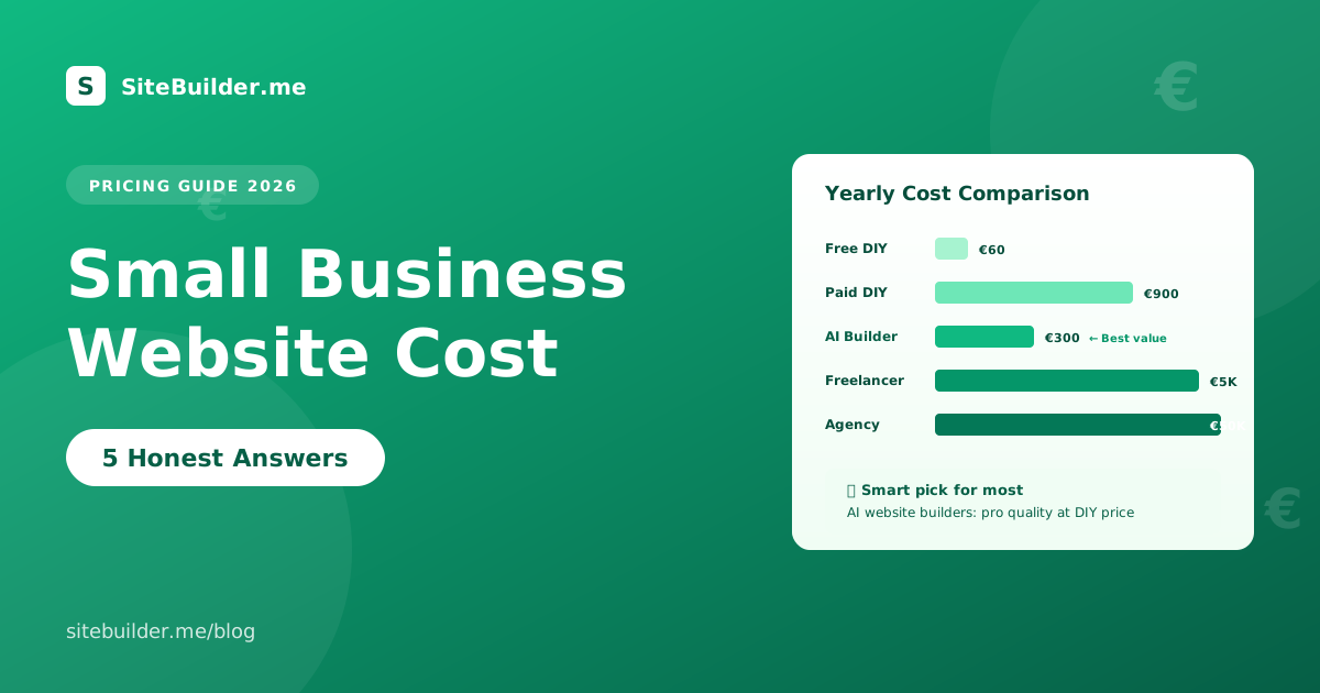
Costs range from free with an AI logo generator, to 5 to 50 EUR for a stock template, to 500 to 3,000 EUR for a freelance designer, to 10,000 EUR or more for an agency brand identity. For most small businesses, an AI logo generator delivers professional results at the lowest cost.
How long does it take to create a business logo?
An AI logo generator produces options in under a minute. Reviewing, picking a favorite and refining takes about an hour. A freelance designer usually needs two to four weeks for a professional logo. An agency brand identity project often takes two to six months.
Can I trademark an AI-generated logo?
In most countries, yes. Trademark law protects the use of a mark in commerce, not the process used to create it. Check with a local trademark lawyer to confirm the rules in your jurisdiction and to run a proper trademark search before filing.
What file formats do I need for my business logo?
At minimum, you need SVG (vector), PNG with transparent background (web use), JPG (universal compatibility), and PDF (for printers). Vector formats like SVG or AI are essential because they scale to any size without quality loss.
Can I change my logo later?
Yes, but rebranding is expensive and disruptive. Every business card, sign, invoice, website and social profile needs updating. Design a logo you can live with for at least three to five years. If you refresh, keep the recognizable core intact so customers do not lose the connection.
Ready to Create Your Business Logo?
Now that you know how to create a business logo the right way, the next step is to actually build one. Try the SiteBuilder.me AI logo generator and produce ten professional logo options for your business in under sixty seconds. Full ownership, editable vectors, ready to use everywhere.